![]()
ACUMEN is a Belgian IT-company specialised in Business intelligence (BI).
A common metaphor for business intelligence is that of an iceberg; only a small part is visible, the most important BI is below the surface, below the waterline.
Not satisfied with designs which tried to translate this notion visually, I opted for a mountains’ invisible snow top. The white line is the path to the invisible pinnacle, but also gives the blue and green shape a puzzle connotation, adding to the metaphor.
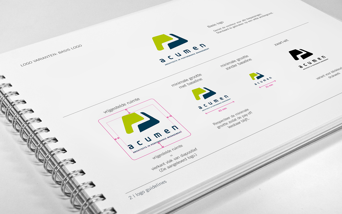
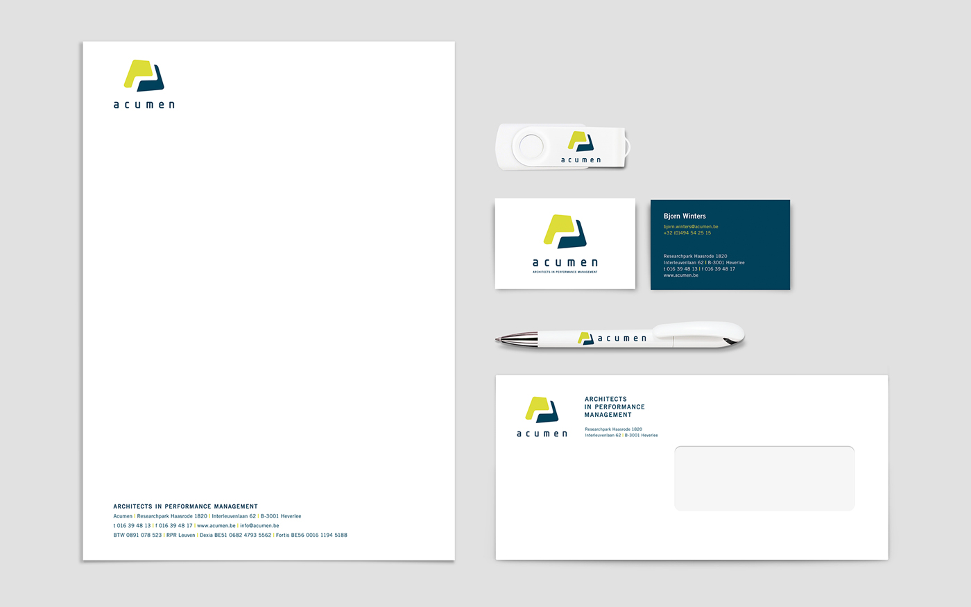
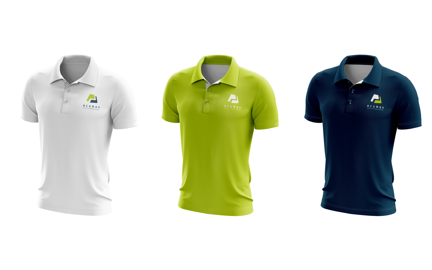
After developing the logo, I was responsible for rolling out the refreshed identity and formulating the brand guidelines.
 realised for Brandhome