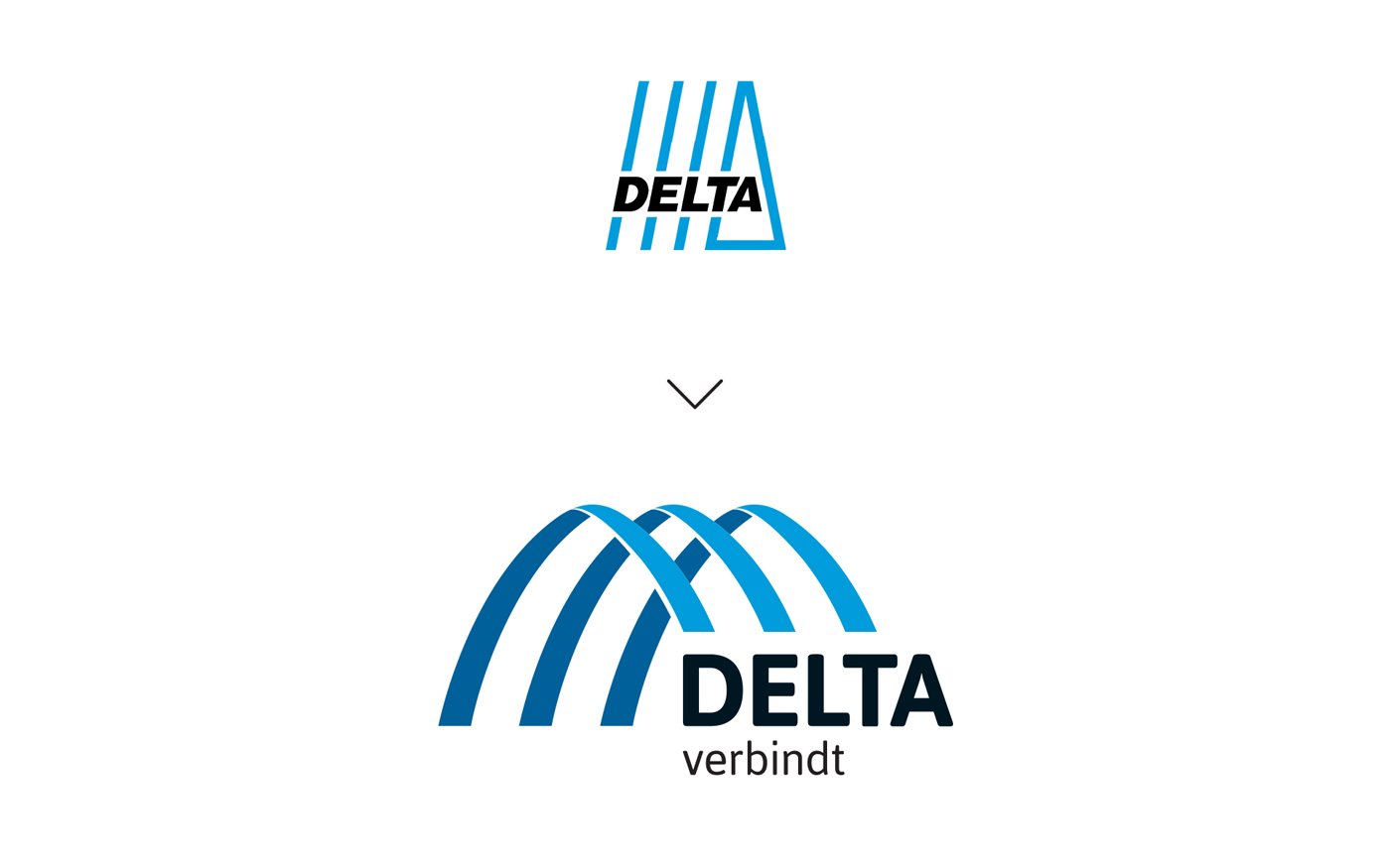
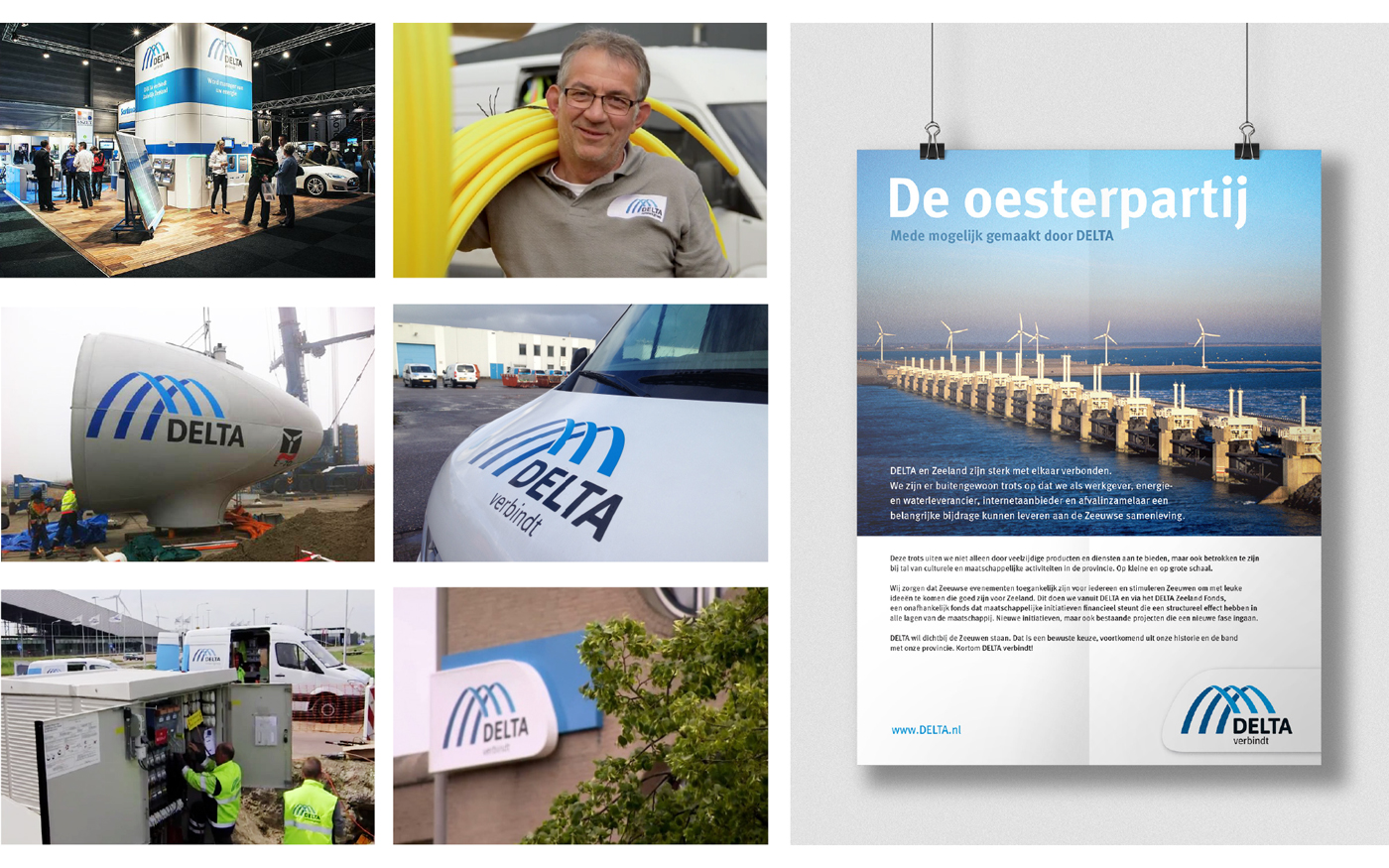
DELTA, a Dutch energy-supplier, decided to change it’s logo after a strategic refocus. DELTA wanted to connect more closely with its customers and the reworked visual identity was to reflect this ambition. The brand name DELTA remained and the baseline “verbindt” (connects) was added.
The rationale behind the new visual mark was to “build bridges” between the corporate DELTA and the Dutch community. The visual mark also refers to the “Deltawerken”: the largest storm surge barrier in the world, located in DELTA’s backyard, from which the company derived it’s name.
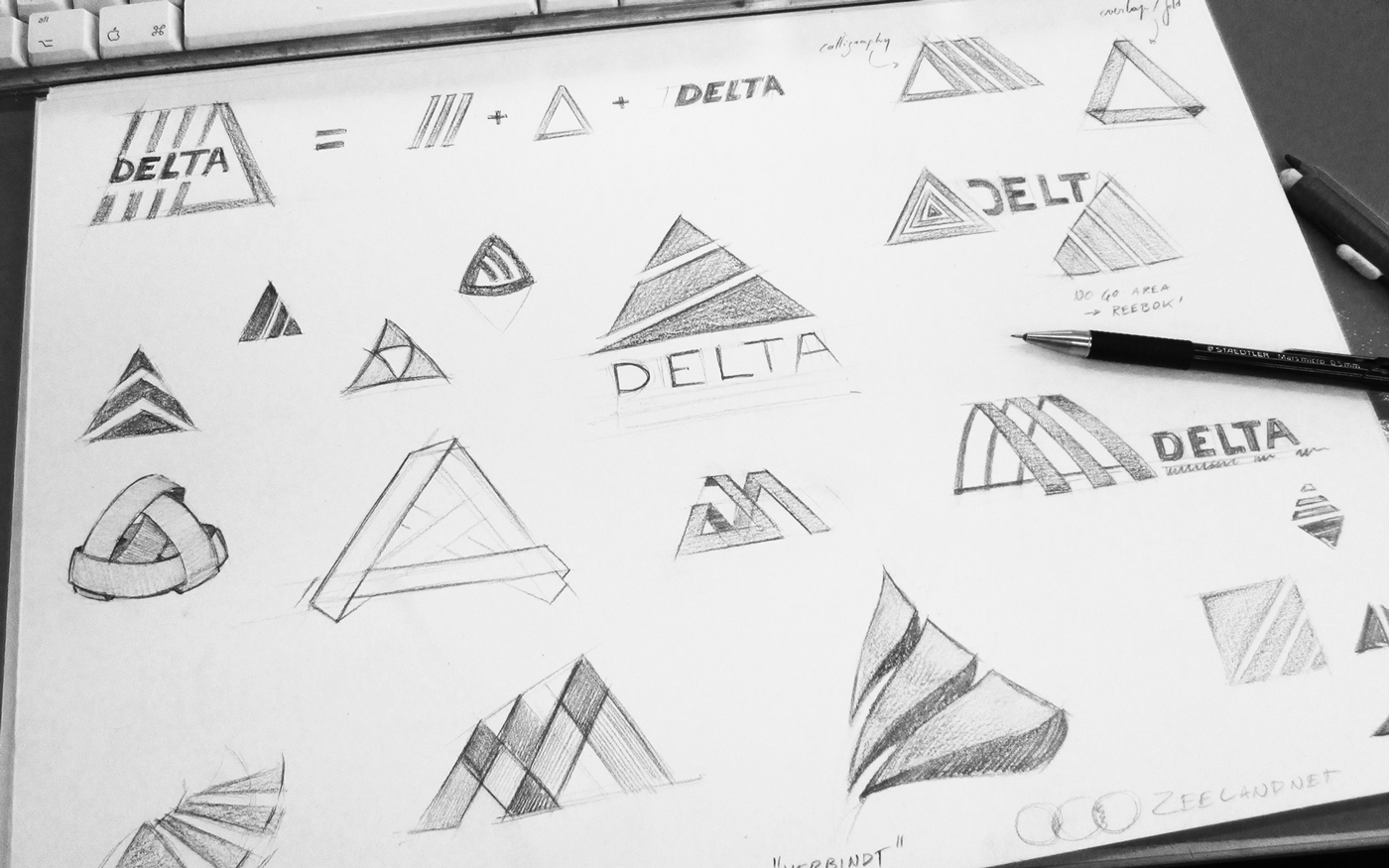
At the start of the design process, it was still unclear whether we wanted to update the current logo, restyle or go for a completely new design. Throughout various iterations, we decided on a restyling. The visual mark was changed, while still maintaining some reference to the previous version of the logo.
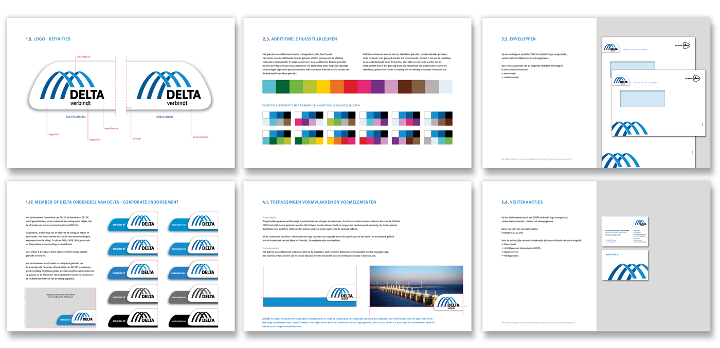
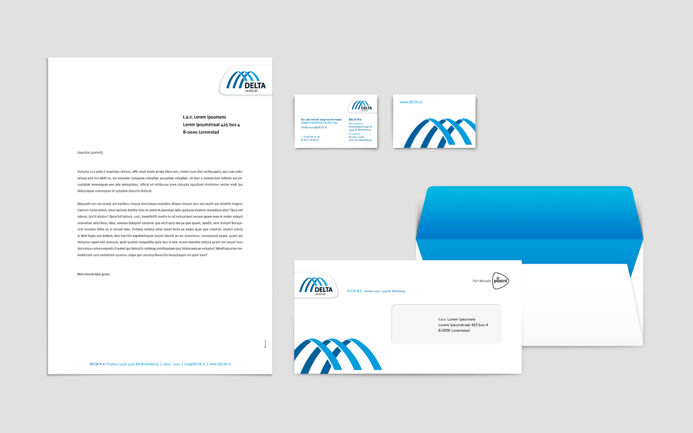
After developing the logo, I created the visual identity and brand expressions, built templates for stationery and formulated the brand guidelines for the restyled brand identity.
realised for Brandhome

