![]()
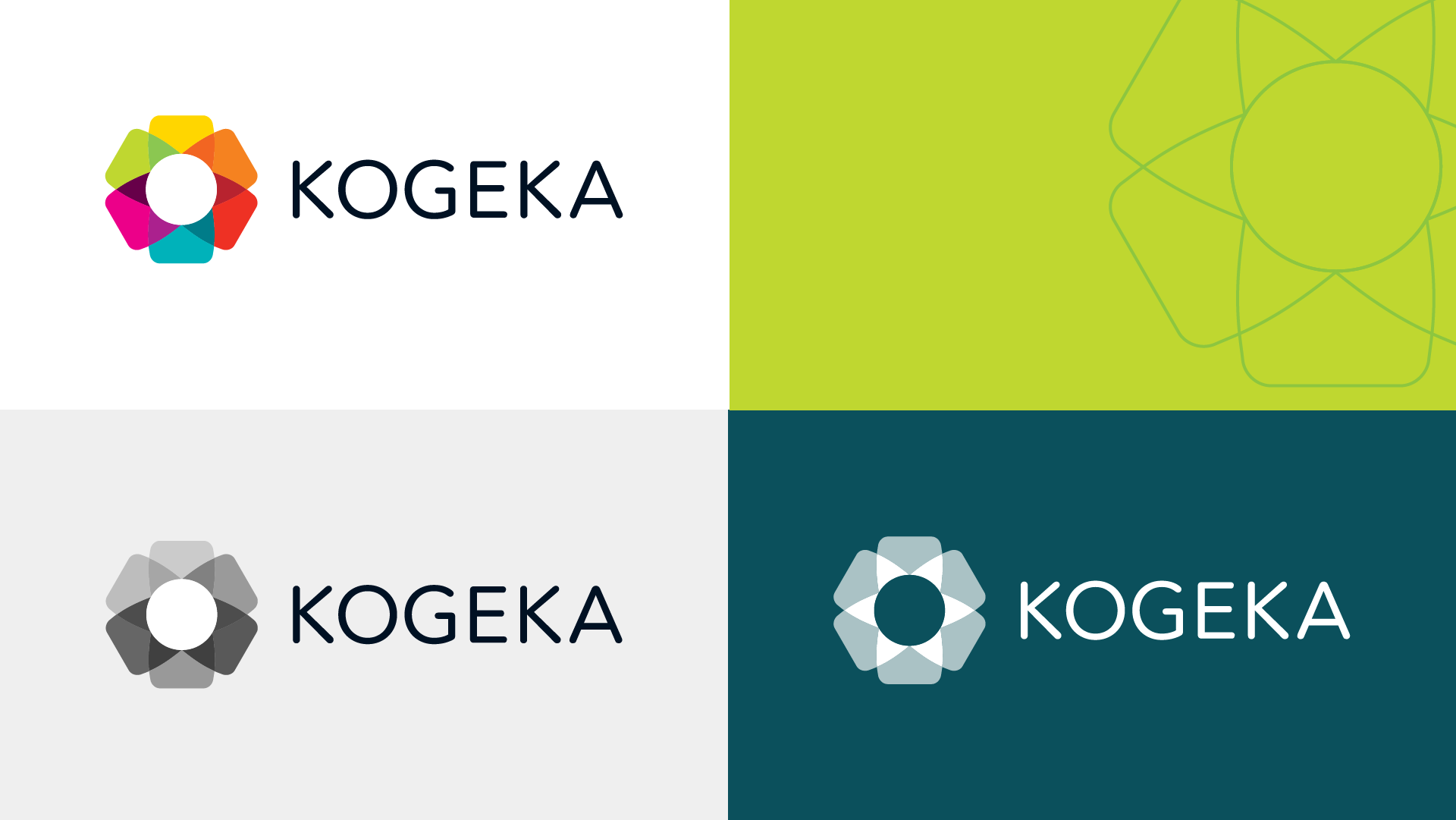
Together with KAN I developed a new visual identity for the Catholic school group KOGEKA. The KOGEKA group is comprised of 6 schools, which form a tight-knit community.
The visual mark refers to a lily, a centuries-old Catholic symbol in a modern styling. Each leaf of the lily represents a school and has its own color, thus the mark becomes a symbol of unity and harmony.
![]()
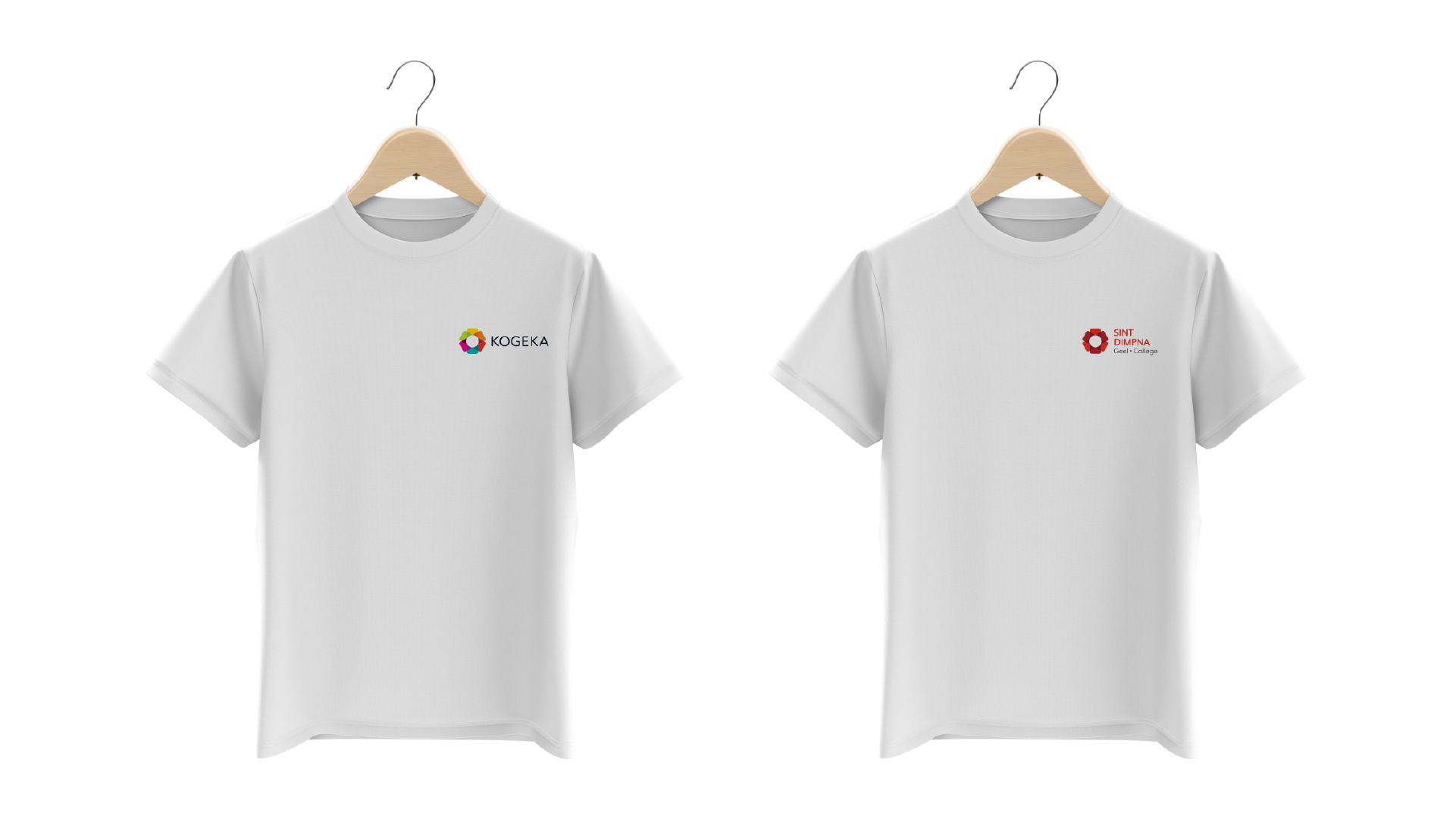
Within the visual identity each school maintains its identity, but the link to the community is enhanced by a shared visual language. KOGEKA supports and strenghtens the schools in its community.
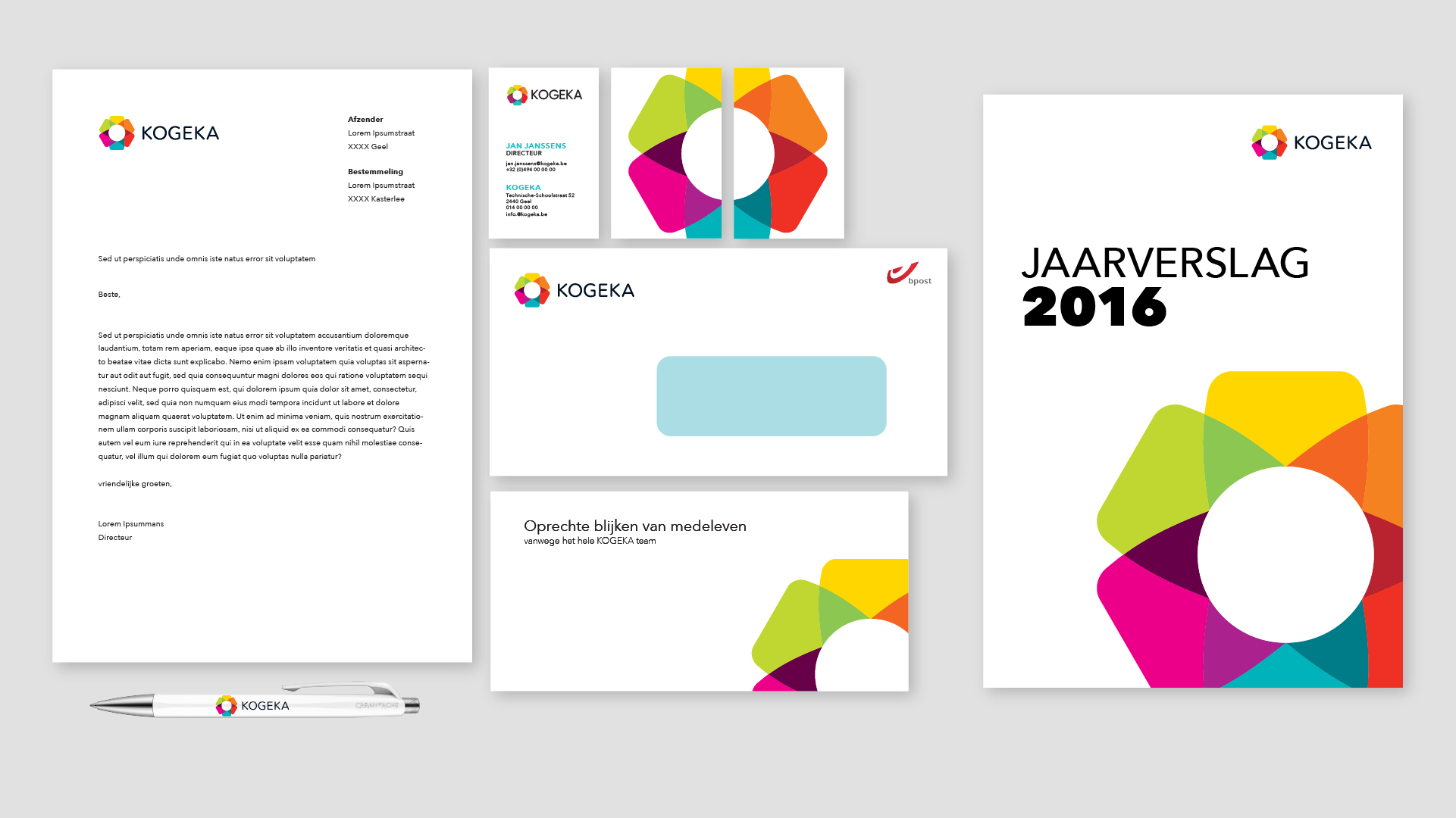
stationery (design proposal)
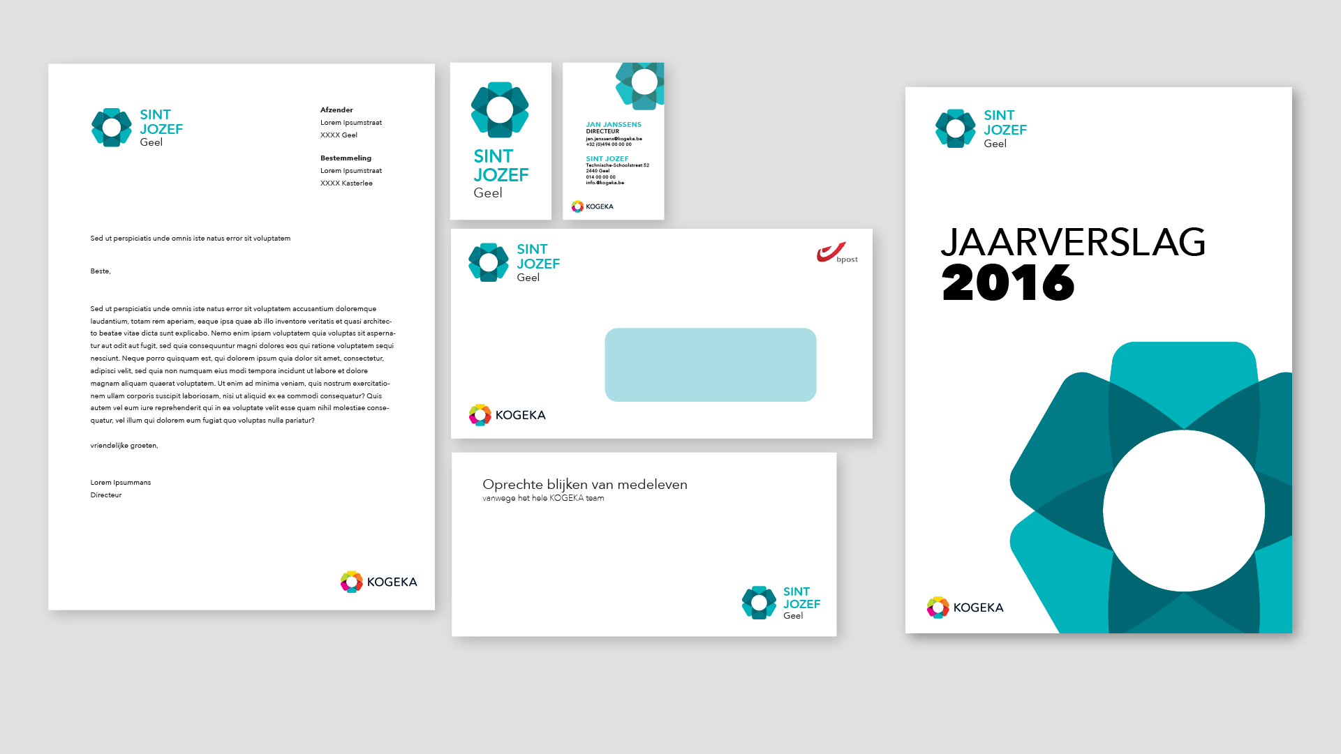
school-specific stationery (design proposal)
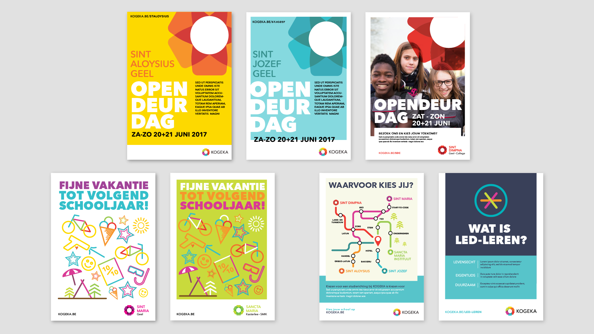
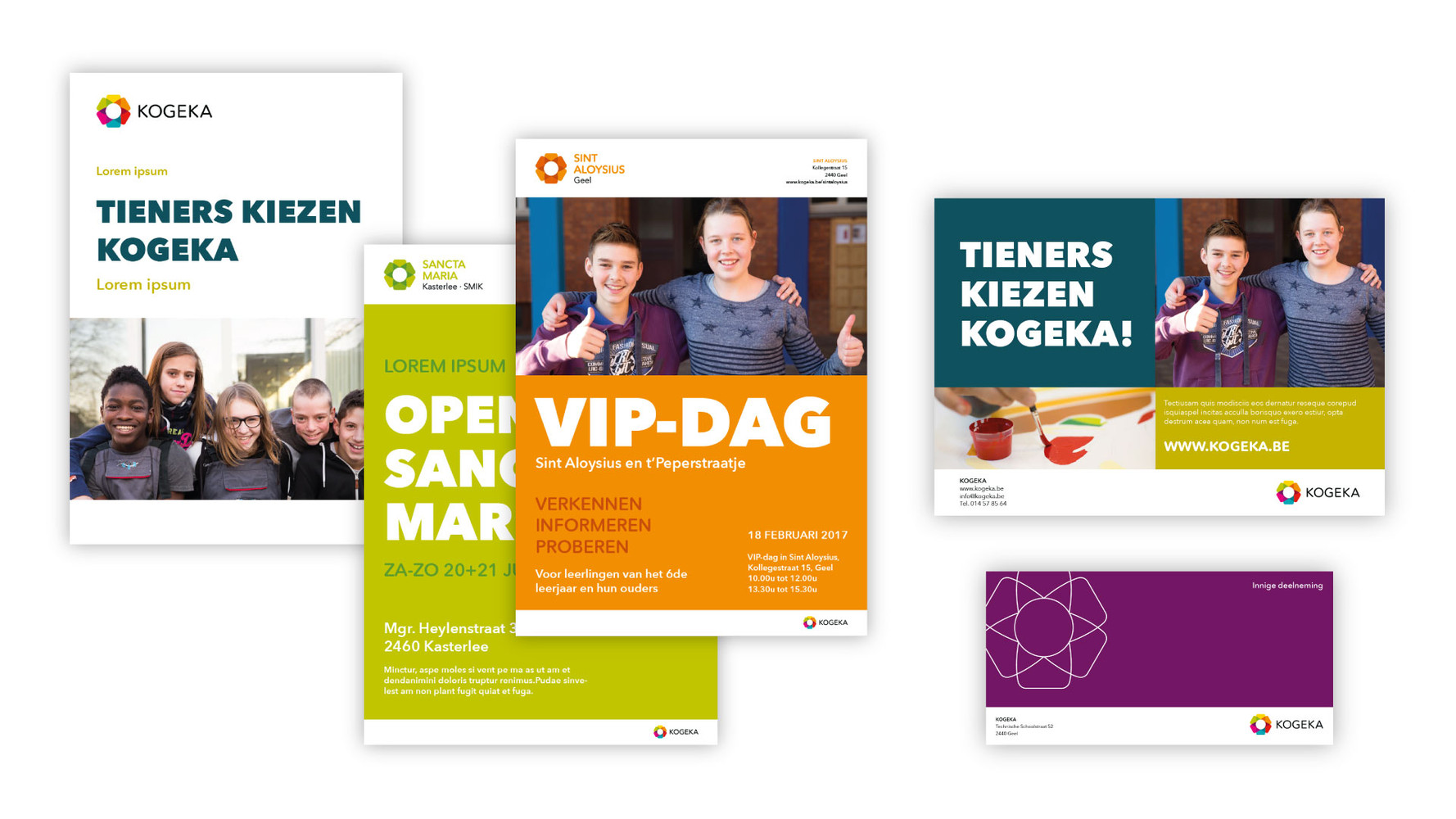
posters (design proposals)
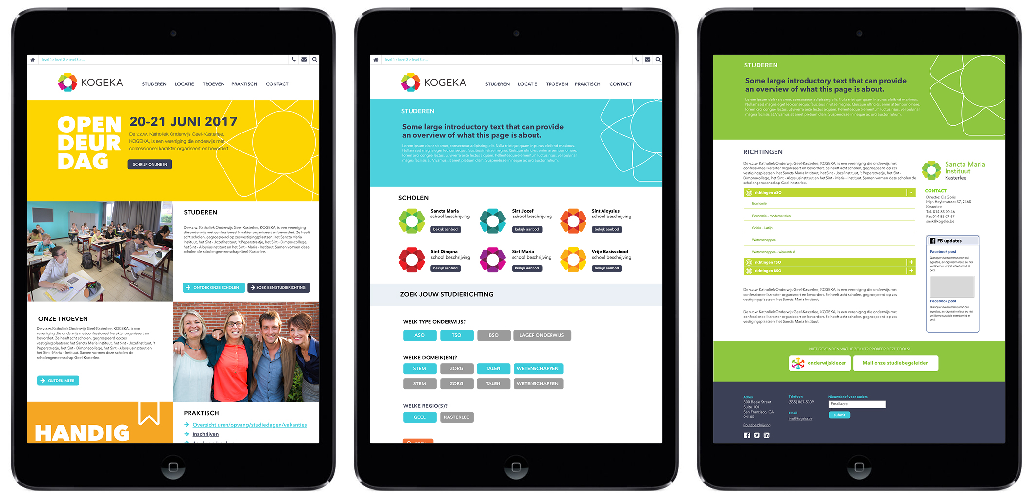
website (design proposal)
The KAN team oversaw the full brand roll-out and further design & development of the KOGEKA website.

realised for KAN